
CMYK vs RGB for Professional Printing: Why Colours Change on Paper
Oct 05, 2026
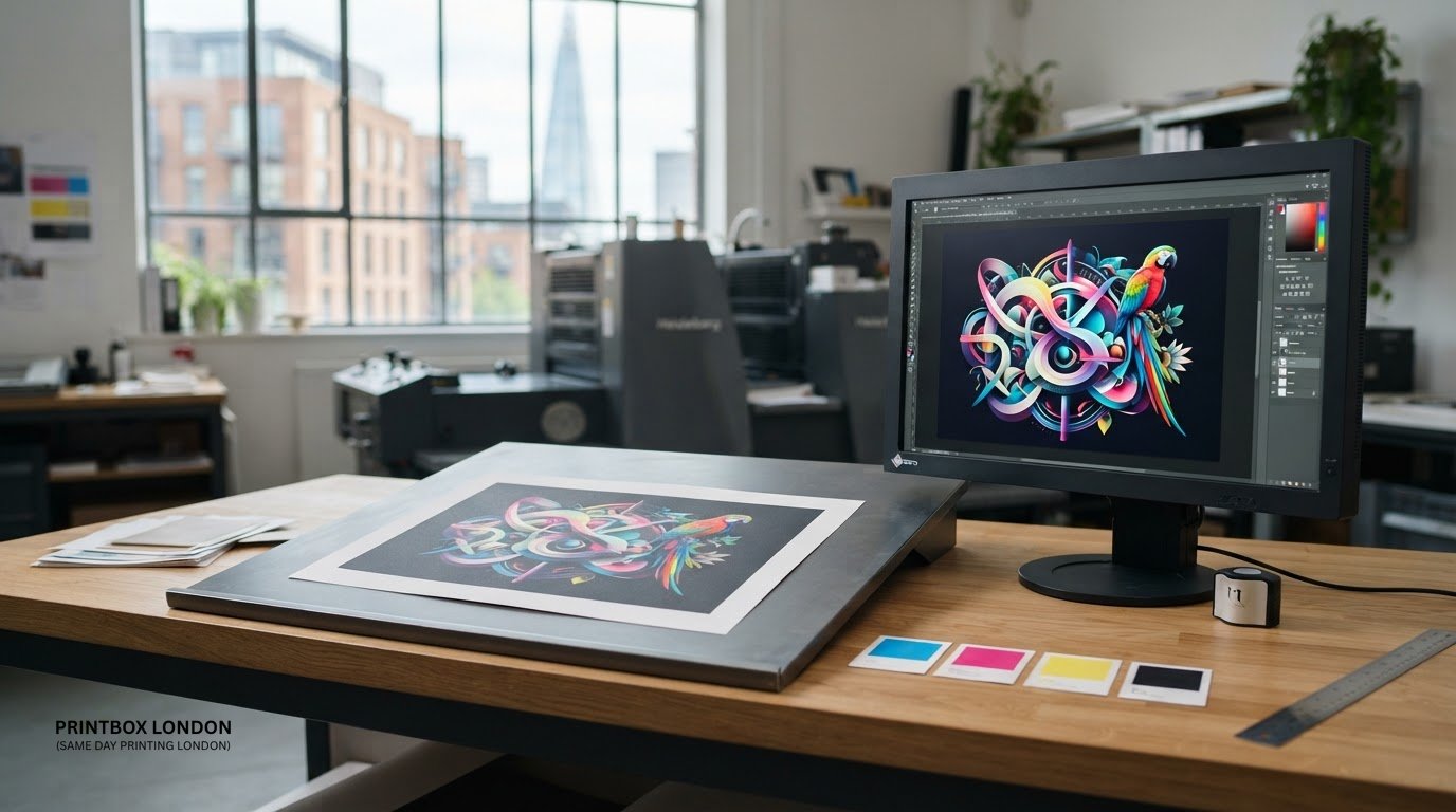
Why can a bright screen design look duller once it’s printed? The difference often starts with colour mode. If you’re weighing up CMYK vs RGB for professional printing, the key point is simple: screens create colour with light, while printers build it with ink on paper.
It’s frustrating when artwork looks right on your monitor but the finished print appears different. That doesn’t necessarily mean anything has gone wrong. Screens can show a wider range of vivid colours than standard CMYK printing can reproduce, and paper, monitor settings and file preparation all affect the result.
This guide explains the practical difference between RGB and CMYK, why colour can shift during printing, and what to check before you submit your artwork. You’ll also learn when to convert a file and what to expect from a print-ready PDF. Printbox London (Same Day Printing London) prefers PDF artwork, with raster images set to 300 dpi at final size and CMYK colour where appropriate. The aim is to help you prepare confidently and set realistic colour expectations before printing.
Key Takeaways
- Understand CMYK vs RGB for professional printing and why converting artwork can affect how colours appear on paper.
- Use CMYK for print output, and check the exported file rather than relying only on how it looks on screen.
- Before sending artwork, review its finished size, image resolution, fonts, layout and suitable bleed where relevant.
- A print-ready PDF is preferred; raster images should target 300 dpi at final size.
- Have your product, size, quantity, finish, deadline and final artwork details ready when arranging a print job.
CMYK vs RGB for professional printing: what each colour mode means
RGB is the colour mode used to display images on screens, while CMYK is the four-colour ink process used to reproduce colour in print. RGB combines red, green and blue light. CMYK combines cyan, magenta, yellow and black ink on a surface such as paper. The two modes create colour differently, so an image that looks vivid on a screen may not look identical when printed.
That difference is central to CMYK vs RGB for professional printing. RGB is designed for light-emitting displays; CMYK is designed for ink on a substrate. Neither mode is simply a quality setting. Each describes how colour is created and should be considered in relation to the final output.
How RGB creates colour on a screen
RGB is an additive colour model: red, green and blue light combine at different strengths to create the colours you see. A screen can add light to make bright colours, and combining the three channels at full intensity produces white. An RGB image remains viewable on a screen before printing, so you can still review and edit your design digitally.
Some bright screen colours fall outside the range that standard CMYK inks can reproduce. A vivid blue or green in a digital advert, for example, may look less intense on paper after conversion. The screen itself also emits light, which can make colours appear brighter than they do in a printed piece viewed under room lighting.
How CMYK creates colour on paper
CMYK is a subtractive colour model. The cyan, magenta, yellow and black channels are printed as layers of ink; together, they absorb different amounts of light reflected from the substrate to create the image. The K channel represents black ink, which helps create dark detail and contrast. The CMYK colour model offers a technical explanation of how this approach differs from additive RGB mixing.
Printed results can vary with the output process and the material being printed on. Paper colour, surface and texture affect how reflected light is perceived, so the same artwork may not look identical across different print conditions. CMYK sets the colour approach, but it doesn't guarantee an exact match to a monitor.
For practical preparation, Printbox London (Same Day Printing London) specifies CMYK colour for raster images. The final appearance still depends on the artwork and print conditions. This matters for full-colour business materials, from a printed poster to a printed banner, where bold screen colours may need a more realistic expectation once reproduced with ink.
Why RGB artwork can look different when printed in CMYK
A screen and a printed page reproduce colour in different ways, and their available colour ranges don’t fully overlap. Some colours visible on a display sit outside the range that can be made with CMYK inks. When RGB artwork is converted for print, those colours have to be represented using the available CMYK range. The result can look less vivid or shift in hue.
A screen preview can show how artwork looks on that display, but it can’t guarantee identical colour in print. Conversion helps prepare a file for ink-based output; it doesn’t make the printed result a perfect copy of every screen.
Why bright blues, greens and gradients can shift
Highly saturated blues and greens are common examples of colours that may appear brighter on screen than on paper. A vivid electric blue in a digital advert, for instance, might print with a softer appearance. Some bright green shades may also look less intense after conversion. The change depends on the particular colour and the conditions used to produce the print, so it isn’t possible to predict one result for every design.
Gradients can reveal colour changes too. A smooth transition shown on a monitor may appear subtly different when translated into CMYK, especially where the source includes colours beyond the printable range. The standard RGB colour space provides a useful reference for understanding colour intended for screen and web display, but it doesn’t define the printed result.
What affects the result beyond the colour mode
Colour mode is only one part of the picture. The print output conditions and material influence how ink appears. A material’s colour, surface and texture can alter the way reflected light is perceived, so artwork reproduced on different materials may not look identical.
Your display affects the preview as well. Screen brightness, display settings and the surrounding light can make a colour seem brighter or more muted. A monitor set to high brightness may make a design look more luminous than the printed piece. For that reason, judge on-screen colour as a guide, not a promise of an exact match.
For CMYK vs RGB for professional printing, the practical step is to prepare artwork for its intended output and keep colour expectations realistic. Printbox London (Same Day Printing London) can help with print requirements for a job; share your print details when you’re ready to discuss the project.
CMYK vs RGB: which file should you send for professional printing?
For print, prepare artwork in CMYK where appropriate, especially raster images, and follow the specifications for your particular job. RGB is suited to screen-first work. A correctly prepared PDF is the preferred file format for Printbox London (Same Day Printing London), though JPG/JPEG, PNG, TIFF and ZIP files are also accepted. Choosing CMYK helps prepare artwork for ink-based output, but it can’t guarantee an exact match to a screen.
| File setup | Best suited to | Practical action |
|---|---|---|
| RGB | Artwork intended for screens, such as digital graphics | For print, follow the job specifications and prepare the file for print output. |
| CMYK | Artwork intended for ink-based printing | Use CMYK for raster images and review the exported file before sending it. |
When to keep a file in RGB and when to prepare CMYK
Keep screen-first designs in RGB while they’re being viewed or used digitally. For printed posters, flyers or business cards, use CMYK for print output and check the supplied specifications before exporting. Printbox London (Same Day Printing London) gives CMYK as the colour target for raster images.
If your design includes both digital and printed versions, keep a suitable screen version and prepare a separate print file where needed. Conversion changes how colour is represented; it doesn’t ensure that printed colours will look identical to a particular monitor.
How resolution and file format fit into colour preparation
Colour mode is only one part of a usable print file. Raster images should target 300 dpi at final size. A low-resolution image can look soft or pixelated in print even if its colour mode is correct. Check that the artwork is set to the intended finished dimensions before assessing its resolution.
PDF is the preferred artwork format. Export and review it at the intended page size, checking that fonts, images and layout appear as expected. JPG/JPEG, PNG and TIFF are accepted alternatives, and ZIP files are accepted for submitting artwork. For edge-to-edge designs, account for bleed and keep important content clear of the trim area. The right setup can vary by job, so use the specifications supplied for your print.
For CMYK vs RGB for professional printing, focus on the final output, not just the file extension: check colour setup, dimensions and image quality together before submitting artwork.
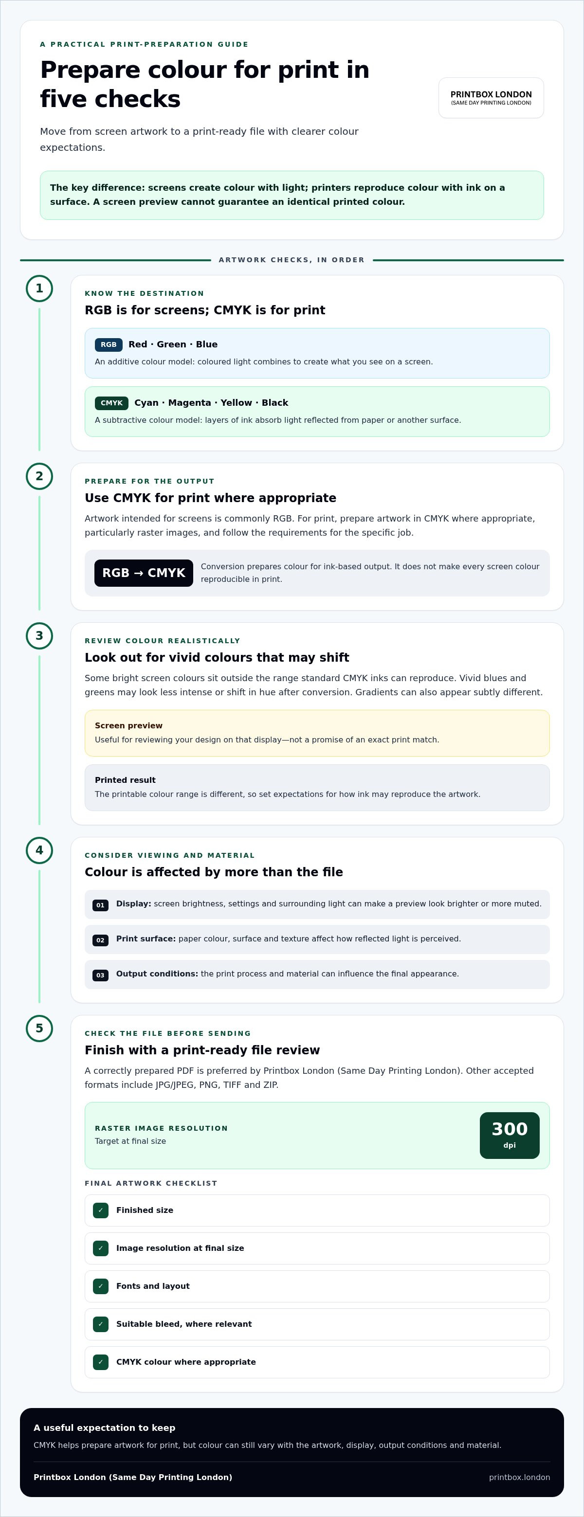
How to check colour before sending artwork to print
A quick pre-flight check can catch layout and file issues before your artwork is submitted. Start with the intended print use and the specifications for that particular job. Then work through the artwork in order, from dimensions and image quality to the final exported file. These checks help you send a file that’s ready to review, though they can’t guarantee an exact screen-to-print colour match.
A quick artwork check before exporting
- Confirm the print use and job specifications. Check the product, finished size, colour requirements and any supplied instructions. Requirements can differ between print jobs.
- Check the finished dimensions. Make sure the document is set to the size you intend to print. View important text and images at final size so you can spot content that looks too small or sits too close to an edge.
- Review image resolution. For raster artwork, aim for 300 dpi at final size. Enlarging a small image can reduce its effective resolution, even if it looks sharp on a screen.
- Inspect fonts and layout. Check that text is readable, nothing is clipped and all elements are in the right position. Review each page if the artwork contains multiple pages.
- Allow for bleed and safe margins where relevant. Bleed extends artwork beyond the trim edge; safe margins keep important content away from that edge. Follow the requirements for the specific product rather than assuming one setup suits every job.
Review the exported file before placing an order
Export the final artwork, then open that file separately. Check that the page size, colours, images, fonts and layout still appear as intended. Don’t rely only on the design application’s canvas: export settings can affect the file you actually submit.
Zoom in to inspect fine details, but also view the whole page to check balance and legibility. Avoid using low-resolution screenshots as substitutes for print-ready artwork. A screenshot may look acceptable at small size on a phone but lack the detail needed at the finished print dimensions.
For CMYK vs RGB for professional printing, checking the exported file is a practical final step: it helps catch avoidable file and layout issues, while colour on a display remains a guide rather than a guarantee of the printed result.
From screen design to London print: practical next steps
The practical rule for CMYK vs RGB for professional printing is straightforward: set up artwork for its intended output, then review the exported file before submitting it. Use CMYK for print-ready raster images, check the job specifications and remember that a screen preview can’t promise an exact colour match on paper.
Clear order details help match the artwork to the job. Before arranging printing in London, have the following information ready:
- Product and finished size: for example, a poster and its final dimensions.
- Quantity: how many copies you need.
- Print layout: whether it’s single-sided or double-sided.
- Material and finish: include your requirements or the options specified for the job.
- Deadline and collection or delivery preference: share your timing and any relevant fulfilment requirements.
- Final artwork: provide the print-ready file or document, with the correct dimensions and colour setup.
Connect colour guidance to the finished print
Full-colour posters are a useful example: a bold design prepared for print may still look different from its screen preview. Check the exported artwork and set realistic expectations for colour on paper. You can explore full-colour poster printing as a relevant option.
Printbox London (Same Day Printing London) provides printing for customers across Greater London from its print shop in Tottenham, North London. Same-day printing is available for selected quantities and specifications, with exact turnaround depending on the job.
Have a print job in mind? Contact Printbox London (Same Day Printing London) with the product, size, quantity, deadline and final artwork to discuss the next step.
Prepare your artwork for a confident print order
CMYK vs RGB for professional printing comes down to matching the artwork to its output. RGB is for screen display; CMYK is used for print. Since screens and ink reproduce colour differently, a conversion can help prepare a file, but it can’t guarantee an exact match to what you see on your monitor.
Before sending artwork, check the finished size, layout and colours in the exported file. A correctly prepared PDF is the preferred format for Printbox London (Same Day Printing London). If your artwork uses raster images, aim for 300 dpi at final size, and include suitable bleed where the job requires it.
Share the product, dimensions, quantity, finishing requirements and deadline with your final artwork. Same-day printing is available for selected quantities and specifications, with exact turnaround depending on the job.
With the file and job details ready, you’re well placed to move from screen design to print with clear expectations.
Frequently Asked Questions
Should I use CMYK or RGB for professional printing?
Use CMYK for print output, particularly for raster images, and RGB for artwork intended mainly for screens. CMYK vs RGB for professional printing is about preparing colour for the way it will be reproduced. Check the specifications for your specific job before exporting. A correctly prepared PDF is the preferred artwork format for Printbox London (Same Day Printing London), and the exported file should be reviewed before submission.
What happens if I send an RGB file for printing?
An RGB file may need to be converted to CMYK for ink-based printing. During conversion, colours that the print process can’t reproduce in the same way may look less vivid or shift in appearance. The precise result depends on the artwork and output conditions. Don’t assume an RGB file will print exactly as it appears on your monitor. For a more predictable hand-off, follow the job specifications and check the final exported artwork.
Can CMYK colours look the same as they do on my screen?
Not always. A screen emits light, while printed colour is seen as light reflected from ink and the print material. Your monitor’s brightness and display settings also affect its preview. CMYK artwork can help prepare a design for print, but it can’t guarantee an exact match to a particular screen. Treat the display as a useful guide, rather than a promise of how the finished print will look.
How do I convert an RGB image to CMYK for print?
Use the colour-mode or export settings in your design or image-editing software to prepare a CMYK version, then review the exported file before submitting it. The exact steps vary between programmes, so follow the instructions for your software and the specifications supplied for the job. Conversion can change how some colours appear. Check the finished size and image quality too, rather than treating colour conversion as the only artwork check.
Is PDF or JPEG better for professional printing?
A correctly prepared PDF is the preferred artwork format for Printbox London (Same Day Printing London). It’s a practical choice for keeping a finished layout together for review. JPG and JPEG files are accepted too, but check that the image is at the correct finished size and has sufficient resolution. Printbox London (Same Day Printing London) serves customers across Greater London, with its physical print shop in Tottenham, North London.
What resolution should images have for print?
Raster images should target 300 dpi at final size. DPI describes image detail relative to its printed dimensions, so an image that looks sharp when small on screen may appear soft if enlarged. Set the artwork to its intended finished size before checking resolution. Avoid low-resolution screenshots as print artwork. If the file includes several images, check their quality in the exported document as well as in the design application.
Do I need to convert every image to CMYK before sending artwork?
Not necessarily as separate files. The key is to prepare the final artwork for print and follow the specifications for the job. Printbox London (Same Day Printing London) gives CMYK as the colour target for raster images. If images are placed inside a PDF, review the exported PDF and make sure the overall document is ready for printing. Conversion alone won’t guarantee an exact colour match to your screen.
Article by
Printbox London Team
The Printbox London (Same Day Printing London) team provides practical printing guidance based on real customer requirements and day-to-day print production. We serve customers across Greater London from our Tottenham print shop, with same-day printing available for many products depending on quantity, specification, artwork and production capacity.