")
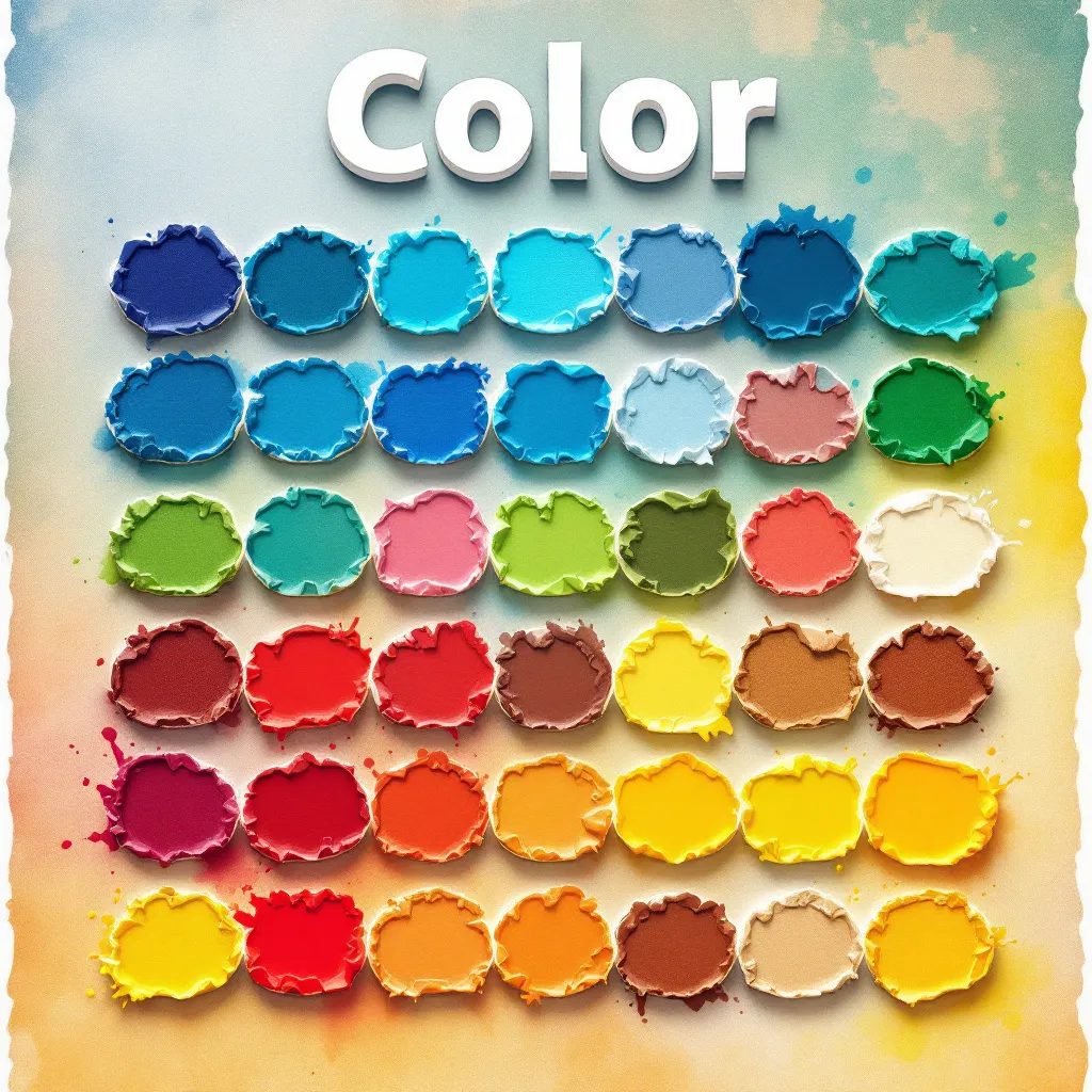
The Psychology of Color in Print Materials: What You Should Know
Sep 14, 2025
Psychology of Color in Print Materials: How to Influence Customer Perception
If you've ever noticed how certain colours evoke different feelings, you're not alone! In the realm of print materials, understanding the psychology of colour can significantly impact your marketing strategy and influence customer behaviour. In this article, we’ll explore how colour affects branding, demographics, and design decisions—helping you choose the right hues for your print materials at Printbox London. By the end, you’ll see how this knowledge can elevate your business with high-impact prints.
Table of Contents
- Understanding Colour Psychology
- Colour in Branding
- The Impact of Colour on Different Demographics
- Popular Colours and Their Meanings
- Best Practices for Using Colour in Print Materials
- Conclusion
Understanding Colour Psychology
Colours have an inherent ability to influence our emotions, decisions, and perceptions. Warm colours like red and orange energise and stimulate action, while cool colours like blue and green promote calm and trust. This fundamental knowledge is crucial when creating effective print materials such as flyers or business cards that truly connect with your audience.
Colour in Branding
Your brand’s colour palette is one of the strongest identifiers of your business. Consistency across brochures, posters, and packaging reinforces brand identity and builds recognition.
Examples of Effective Colour Branding
- Coca-Cola: Bold red for passion and excitement.
- Facebook: Calm blue for trust and dependability.
- Starbucks: Green for harmony, growth, and balance.
The Impact of Colour on Different Demographics
Not all colours speak to every demographic the same way. Understanding cultural and personal preferences is vital for tailoring your message. For example:
- Age: Younger audiences often prefer vibrant tones, while older groups lean towards muted, sophisticated shades.
- Gender: Studies show women often favour softer palettes, while men prefer bold, primary colours.
- Culture: Red may symbolise luck in some regions, but danger in others.
Popular Colours and Their Meanings
- Red: Energy, urgency, passion
- Blue: Trust, calm, professionalism
- Green: Growth, health, renewal
- Yellow: Happiness, optimism
- Purple: Creativity, luxury
- Black: Sophistication, elegance
Best Practices for Using Colour in Print Materials
When planning your next campaign with Printbox London, keep these colour best practices in mind:
- Limit Your Palette: Stick to 2–3 dominant colours for clarity.
- Create Contrast: Ensure text and background colours are easy to read.
- Stay Consistent: Use the same colours across posters, banners, and business cards to build recognition.
- Test with Your Audience: Gather feedback on your designs before going to print.
Conclusion
Colour psychology isn’t just about aesthetics—it’s about shaping perception and driving action. By selecting the right palette, you can enhance your brand, engage customers, and inspire trust. At Printbox London, we specialise in creating same-day banners, business cards, flyers, and more—helping you use colour effectively to stand out in the marketplace.
Start Your Print Project Today
Ready to bring your colours to life? Contact us now for same-day printing in London.
- Call us: 0207 018 5678
- WhatsApp: 0207 018 5678
- Email: hello@printbox.london
- Visit: Contact Page
- Get Directions